Monday, 15 May 2017
0:03 The second you see the crosshair on the screen it appeals the viewer making the viewer think that there is much more behind this video
0:05 Overlapping Action takes place here when the black overlaps with the white to change the scene.
1:15 Lines in the background create a secondary action.
-Pacing in this video is based on voices in the background of the video and change of tone in people's voices
-The Colours that were used where just black and white, these two colours indicate the both sides in the conversation (good and bad).
-Many secondary actions throughout the video are very effective in making the video more visually pleasing.
-The mood of this piece is dark because of how emotional this scene is in the show the typographer had to portray this in his art making this piece have a dark emotional feel.


Lighting
Lighting here is overall this portraits best feature, the photographer in this photo uses darks and lights to show off the curves and details in his face that work well with the black and white.
Expression
This photo shows Robert Downey Jr. looking very concentrated at a object that could be out of frame. The photographer took this photo in such detail sort of showing the viewer a more tough side of Robert.
Background
The background of this photo is black, I assume the photographer chose this simplistic background to contrast with the lights and darks contouring his face.
Pose and Posture
The pose and posture of this portrait show a more relaxed side of Robert using exposed close up photography in a relaxed, mid action pose.
Eyes and Direction of Gaze
Robert is looking away from the camera as if it isn't there, this says that he is trying to portray a more natural side of himself.
Color and Contrast
Color isn't a very important part of this at all because it contains no color at all, but contrast is very important here because it creates the contours around his face.
Why I picked this photo
To start I picked this photo because my favorite types of portraits it seems are close high detail photographs in black and white. I think those three components are just a very good combination, I was also drawn towards this because I think it takes real skill to perfect lighting in such a way this photographer portrayed Robert Downey Jr. here.
Wednesday, 3 May 2017
For my portrait, I went for pop art styling. Originally I was planning on choosing a graffiti style based off Michel Basquiat, but I came across a portrait of Michel Basquiat by Andy Warhol which gave me the inspiration to do a pop art style. Overall I feel that it was a good choice to do pop art because it seemed easier to do that art style digitally.
Overall I am not very satisfied with the final project. I wish I was able to create a similar background with my own patterns and resolution because the photo I picked for the background ended being a very low resolution by the end of manipulating it.

When making art in any medium you need to make artistic choices to bring the piece of art to a higher viewing level, I had to make allot of choices making this piece of art. The first decision I had to make was how am I going to make was what am I going to do and how am I going to make it. The first big decision was to chose I program I was going to work on, I decided to use photoshop because it's the program that I was most familiar with and it made the most sense for my project. The second big decision I had to make was what am I going to use for the background of my project, I chose a more surreal acid wash looking background to make the photo brighter. These two decisions affected my picture because Photoshop effect they way I drew myself in the picture, and the background affect the contrast between my dark outline and empty space on the picture.
When making this picture I started by looking through art by my favorite artists to get inspiration. After I chose what style I wanted I started by taking photos of myself to help myself create an outline later on. After getting the photos I traced out my photo in a gritty style. After getting down the outline and focus of the picture I started to make my background. I wanted my background to look like gray acid wash so I did just that, I got a photo of gray acid wash jeans and manipulated the photo into being my background.
Overall I am not very satisfied with the final project. I wish I was able to create a similar background with my own patterns and resolution because the photo I picked for the background ended being a very low resolution by the end of manipulating it.

Wednesday, 12 April 2017

Still Life Drawing
For the past two weeks, we have been working on still life drawings based on the objects put before us. First I started by sketching out the contour of the objects to get the proportions and the positioning right. Then when I was satisfied with the positioning of the lines I drew the contour of the objects with harder more clean lines, overall though the contour was quite light to keep realism in the photo. After finishing the contour I started lightly shading my drawing with an HB pencil, after going over everything with the HB I started to go in with my 2B pencil then after going in with my 6B pencil. Using these different levels of darkness in my shading overall resulted in more realistic shadows in my drawing.
I chose to do an L composition for my drawing. I chose this composition because it had the best flow of objects for what position I had of the objects. My L composition consists of two skulls making the bottom of the L and the vase making the vertical part of the L. After drawing the basic outline of my composition I started to shade in the curtains behind the skulls to fill in the negative space.
Friday, 24 February 2017
Go look at my slide show on earth art here.
https://docs.google.com/presentation/d/13p42x7XUEOeKLxSdS3POh8KccQ8r0s7qbgZwc0KNduw/edit#slide=id.p
https://docs.google.com/presentation/d/13p42x7XUEOeKLxSdS3POh8KccQ8r0s7qbgZwc0KNduw/edit#slide=id.p
Thursday, 16 February 2017
Photography Basics

Shallow Depth of Field
This shows a shallow depth of field because of high focus on the focal point and a blur effect on the part that the photographer doesn't want to focus in on.

Long Depth of Field
This photo shows a long depth of field because of it's long range of focus showing everything the photographer can see at that moment.

Low Shutter Speed
This photo was taken with low shutter speed, you can see this because it shows this man's entire movement instead of capturing that exact moment in time when clicking the camera.
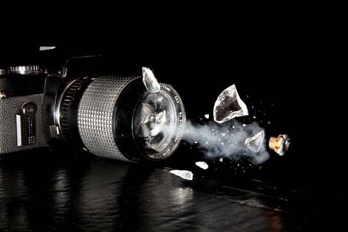
High Shutter Speed
This is high shutter speed, you can see this because the exact moment in time was captured when the photographer took the photo.

High ISO
This is a high ISO photo because we are able to see all this detail in the dark (this is the camera letting in all the light as it can to let us see the picture) and because of the graininess, it creates when putting the ISO this high.

Low ISO
This photo has a low ISO due to it being relatively dark and its low amount of grain. The reason why the photo is so dark in what seems to be a bright scenario is because the camera is letting in less light making the photo look better.
Friday, 10 February 2017
Q#1.)When Richard Avedon talks about contradiction and complexity in the face I think he is talking about the emotions in people's faces and how each face has a certain complexity to it depending on their emotion, upbringing and background.
Q#2.)When Avedon decided to go with simple, clean cut photography with a white background it achieved focus. The white background makes you focus on the subject he is trying make the viewer look at.
Q#3.) With painting even if you have a realistic painting the exact moment will never be captured because of the time it takes to produce a painting. Photographs capture that moment in time almost exactly, taking seconds to produce. I think we migrate to photography more because of how fast-moving we are, making us want results instantly.
Monday, 6 February 2017


Monday, 11 January 2016
Tuesday, 15 December 2015
My message I was trying to get across for this project was
that military AI in the future could get dangerous for civilians and my cause
terror in the future. I was inspired to make this because I saw a series of
videos on YouTube that were involving defense robots made by the military that
were controlled by AI, most of these robots were modeled after dogs or even
humanoids. To replace robots in my image I used manikins because they were the
closest thing that looked like a robot that I could shoot, I also shot a field
for the ‘’robots’’ to stand on, I added in two other photos that were not mine
because they were simply out of reach like a gun or a high quality photo of the
city.
When I came up with the first idea for this image and
sketching it was just drawing a field with robots with guns, it slowly evolved
to drawing manikins because I quickly realized what I had to shoot with, then I
started drawing the field near the parking lot by my school. When I first fully
realized what I would be doing I quickly went to go shoot the images I needed
like the field and my manikins. After I shot them I edited then put them
together in Photoshop. The next thing I did was getting the guns I needed from
the Internet and put in into my picture but I realized the picture looked a
little plan even with the gun in it so I put a couple of buildings in the
background to make it less bare. I chose to put a couple of building in the
background because if there are a robot walking around you would assume it is
the future and there would be buildings everywhere so I put them in. After
editing all the photos I changed the way they looked with levels, I blended
them all with masks and the command J tool and it created my final product.
I learned allot while making this project and preparing for
it one the biggest lessons I learned was that the mask tool is allot more handy
then I thought before I made this image I knew how to use the tool before but I
never put it into anything and now I realize how good it is. Another big thing
I learned was how to use the command J tool properly I never used to use it
because of I how difficult I thought it was to use all I knew about it was that
it blended you pictures better, now that I know how to use it properly it has
help me allot with my final image. At the end of the day I will admit that I am
not as satisfied with my final product as I thought I was going to be, when I
finished the image it looked allot different then I had in my head my final
image felt empty compared to what I was thinking I feel like I should of added
more to the photo but I had no idea for what else I should add. At the end of
the day though had allot of fun with this exercise and I am exited for more
project in the future.

Wednesday, 18 November 2015
Saturday, 7 November 2015

Definition - Intentional Blur is when you
purposely blur a certain area of your photo. Why I chose this Photo - I chose this photo because I intentionally
blurred around the subject to create an effect
that looks like he is moving down the hall without moving.

Definition - Overlapping is when you put the objects over each other to create depth in a photo.
Why I Chose this Photo - I chose this
photo because you can see the buildings in the background overlapping to create
a feel of depth.

Definition - Asymmetrical balances are
when both sides of the photo are different but have similarities in each other.
Why I Chose this Photo - I chose this photo because
the lights in the hallway display cases and the floor are the same on both
sides but there are also big different
in both sides.

Definition - Is a picture that highlights
the shape or form of a figure.
Why I Chose this Photo - I chose this because
the buildings make a box around the figure to highlight it.

Framing

Definition - A man
made object that frames something in the photo.
Why I Chose this
Photo - I chose that because the outlining of the hallway frames the of the photo.

Depth Linear
Perspective
Definition - When a line is creating depth
in a photo.
Why I Chose this Photo - I chose this because
this line is creating a sense of depth to the photo.

Definition - When a line leads your eye to
a certain part of a photo.
Why I Chose this Photo - If you look closely
the line of plants leads your eye to the tree at the end of the photo.

Definition - A consistent repeating
object.
Why I Chose this Photo - I chose this because
the tiles on the wall are repeating a pattern through the left side of the
photo.

Definition - A picture that is pushed to the
side so it is not centered.
Why I Chose this Photo - I chose this because it
is not centered and is pushed to the right.

Depth Selective Focus
Definition - Using selective focus to create
depth in a photo.
Why I Chose this Photo - I chose this because
I used selective focus only on certain parts of a photo to create depth.
Subscribe to:
Posts (Atom)