Tuesday 27 October 2015


                                    Pintrest Art Analysis

Title of artwork Shaman’s Face
Artists name Karoo Ashevak
Date of artwork not found
Size 6.5x6.5
Medium stone, bone, ivory

The art I chose was a piece of art named the Shaman’s Face it’s a piece by Karoo Ashevak. This piece of art used lots of stone, bone and ivory I think this medium is very unique and pretty to look at. Most of the shapes I see in this photo are very round like the eyes the shape of the head and around his mouth, the artist also using some rectangles in this piece of art like the surface below the head, his mouth and his nose. In this photo it looked like the artist used allot of smooth surfaces in this art like the face but he also uses a more hard and rough surfaces like the platform holding the head.

The first detail I look at when I see this piece of art is his eyes because the colour of them stands out form the rest of his face. The materials he used for this piece of art is very nice to look at because it has little cracks in it that bring out a lighter colour then the rest of the art witch brings allot more detail to the face. The light colour they used for the rectangular surface below the head brought allot of contras between the head and the surface below it.

When I look at this piece of art it reminds me of the arctic because of the hood he is he wearing. I don’t really know what this artist was trying to express when making this piece of art but I have a couple of guesses, I think when he was making this art he was trying to tell people to stay happy and positive no matter what happens but I a not entirely sure what it means.


This piece of art is very calm and simple and easy to look at, there isn’t very much complexity to it witch is more fitting for what this piece of art is. I really like the Shaman’s Face and I hope you did as well thank you.

Wednesday 21 October 2015

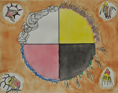
This is the painting I made with my friend of the medicine wheel. We made the medicine wheel because of a project we were doing, everyone in the project painted something that had to do with he seven father teachings. Dont forget to check out my friends blog http://artistbrew.blogspot.ca/

Friday 16 October 2015


The company I made for my logo is called photogiraph and the reason I named it photogiraph is because, my company I made is a photograph company that’s manly focuses and taking professional pictures for people. I chose the name photogiraph because my logo is a giraffe and my company is a photograph company so it just makes sense to put the to word together.

I chose a giraffe for my logo because giraffes are just silly, funny and friendly which would appeal to the demographic I am looking for. Since I am a photo company I think it’s good that my logo friendly and silly because if it was not most people would most likely be nervous getting there photo taken.

For my pictographic logos I was going for the friendliest look as possible so it will go with the title and the company I based it off of. For my color logo I was trying to make the colors pop so it would catch the viewers eyes. For my black and white logo I was trying to make it stand out by not filling in the spots and just leaving the outline of the spots white I feel like it gave the logo and little bit more flare and interesting look. Last but not least what I did for my grey scale logo, I was really trying to go with a more a tame look while I was making this grey scale because I think I would be better in a little more serious occasions, don’t get me wrong the logo for the grey scale is still really friendly it’s just it’s little bit more held back for different occasions.    

On my typographic logo I tried to make it go with the whole giraffe theme. I made some of the letters in the type longer then other to try to simulate a giraffes neck. For my color version of the type I made a black background behind the red letters to form a shadow. When I was making the black and white version of my type I was trying to make it look as similar as the color version for consistency so everybody can notice the logo in back and white.

For my combination logo I was trying to make it fit together as well as possible and I think I did that. By combining the logo inside the type it made it look allot more professional. For the colored combination logo I was sticking with the color theme that I had with my original type and my original pictograph I feel like the two colors mixed well. For my black and white combination I was looking for consistency like I was talking about with my black and white type so everyone can recognize it in black in white instead of color.


For my logo assignment I feel that did an okay job. I think that I could of put more details on the giraffes face and legs and I also think I could have made my combination logo better then it was. Thank you for reading my analysis for my company logo.


Thursday 8 October 2015


Aaron Draplin

In the video Aaron told us about going through the process of logo design and it was very interesting and it help me with my rough sketches allot because i didn't think you could do it the way he did. I think that the creators of this video did a really good job filiming it, they filimed it like a documentary it that helped get Aarons points that he made across. I thought that this was very helpful and i think if other people wanted to get into logo design they should start with this video.

Tuesday 6 October 2015


 This is a cool piece of art i found on pintrest made by Rita Letendre. The yellows are very vibrant and the black corners make a good contras between the two colours. This is a website that has most of her art on ithttp://www.galeriemichelguimont.com/expositions/rita-letendre/ .